South Kitsap schools officials eye logo redesign
Published 4:12 pm Thursday, August 20, 2015
Apples. Books. Keys.
Michelle Reid, South Kitsap School District superintendent, said there is a “clutter of ideas and symbols” that attempt to represent the community’s largest employer.
For those reasons, Reid wants to rebrand the district with a unifying logo. Two finalists designed by Blue Creation’s Adam Smith were presented during the Aug. 5 school board meeting.
“It’s an opportunity to just do a refresh,” Reid said. “Almost every organization has those moments where they need to pause, refresh and then move forward. We’re at that crossroad.”
The current main SKSD logo features a pair of staggered green books with a white apple on top. Amy Miller, the district’s director of community relations, said that was introduced by SKSD in 2003 and updated four or five years later.
“I’ve seen several iterations of the books and apple,” Reid said. “Some don’t even have an apple.”
Miller shared similar sentiments.
“I think people just tweaked it and made it their own, which isn’t the idea,” she said.
SKSD also has a variety of secondary symbols, including a green oval that features a white key and the letters SK attached to it. That was introduced in 2010 under then-superintendent Dave LaRose.
“There are all kinds of logos out there,” Reid said. “Many corporations, many districts, many universities have a unifying symbol and wherever you see it, you know what it is.”
Reid said she thought it was time for a redesign and became acquainted with Smith through the Port Orchard Chamber of Commerce. Smith, a 1997 South Kitsap High School graduate, said he “recently redid [the chamber’s] logo and branding.”
“We started thinking about what we could do to unify our visually identifying pieces,” Smith said.
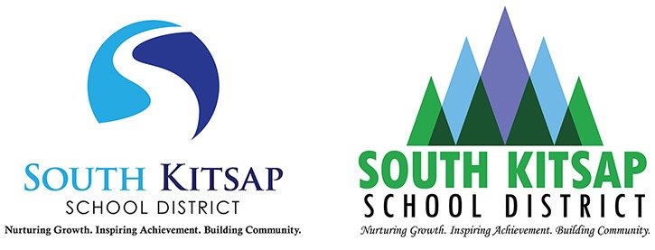
Smith presented the school board with a pair of options: a winding white “S” that curves inside a partial circle with light blue on one side and purple on the other and another logo that used those colors and added green that uses different-sized triangles to represent trees, mountains and water. Both feature different fonts to encompass the district’s name and “Nurturing Growth. Inspiring Achievement. Building Community” motto beneath the logos.
The school board did not vote on the presentation, but most seemed to favor what Smith dubbed “The S Path.”
“What I wanted to do was communicate one’s journey in life,” Smith said.
Reid also favored that logo.
“We’re never going to get 100-percent agreement,” Reid said. “But we really do need a unifying logo that’s recognizable that becomes our district stamp as we roll out our new 2020 plan and strategic plan.
“It’s more than a symbol. It’s a way of unifying our beliefs. I think the S path is really about motion, movement and inviting people into our journey together.”
Reid said while some equate SKSD with maroon because of its primary high school, the district does not have an official color scheme. Smith said he is a fan of SKHS, but steered away from its colors when he designed the logos.
“There also is the alternative high school in the district,” he said. “I didn’t want to alienate anyone.”
School board member Rebecca Diehl said she liked “The S Path” logo, but wanted to replace the purple with green.”
Smith said he likes a blue and green color scheme.
“I really like that color combination,” he said. “I don’t know if it is because of the Seahawks.”
Reid said she still is reviewing the fonts and the actual specific colors with Smith before a final version is selected.
This marks SKSD’s latest rebranding effort under Reid. In August 2014, Miller collaborated with the district’s director of information technology services, Derry Lyons, to redesign SKSD’s website. Reid, who will begin her third year as superintendent in September, said this is the latest step in that effort to streamline and eliminate “clutter.”
“Because there’s so many messages, I think sometimes our focus gets blurred,” she said. “I think what we need to be very clear about is our core focus and have our message be clear both for our people within the district and people within the community.”